How to use the Object-Fit Property in CSS
June 1, 2020
Images used in HTML or JSX will be loaded by default at their actual size and aspect
ratio. Oftentimes we need to fit images into a specific sized container while maintaining
that aspect ratio. For the longest time the background property (instead of <img />
tags) was the primary way to do this.
With object-fit, we can make our images responsive and crop how we want them. This
property works on media elements such as images and videos.
Object-fit values
The object-fit property is assigned to any media element with specified dimensions. It
works similarly to the background CSS property which you can learn more about
here. Once the height and width
are specified, object-fit accepts 5 possible values
| Object-fit Value | What it does |
|---|---|
| contain | fits entire image into the element |
| cover | fills element generally cropping the image |
| fill | fills entire element, generally stretching the image |
| none | doesn’t resize the image |
| scale-down | smaller option of none and contain |
The first two options tend to cover a majority of the use cases for object-fit.
Object-position
This property is similar to the background-position property for background images. If
your image doesn’t fit perfectly in the container, this property will allow you to specify
how to align it.
Object-position accepts two arguments, horizontal alignment and vertical alignment.
Percentages (0%, 50%, 100%) or keywords (top, center, bottom, etc) can be used to specify
the position. By default, this property is set to 50%, 50% which is equivalent to
center, center. The top-left of an element is equivalent to 0% 0% or top left while
the bottom-right is 100% 100% or bottom right.
Examples
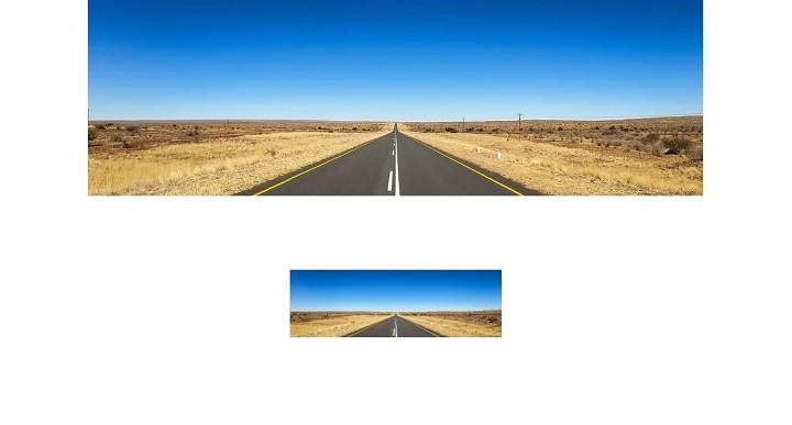
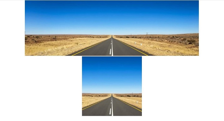
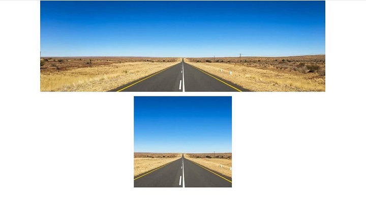
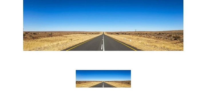
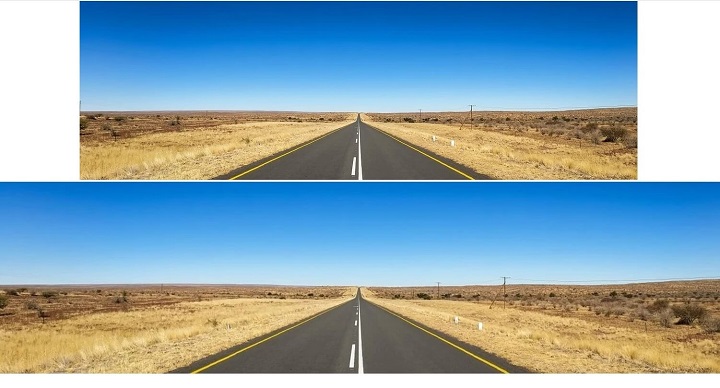
For comparison in each example, the original image with no properties will be at the top. The second image will fit inside a 400px by 400px container beneath it.
Without object-fit (crunches image)
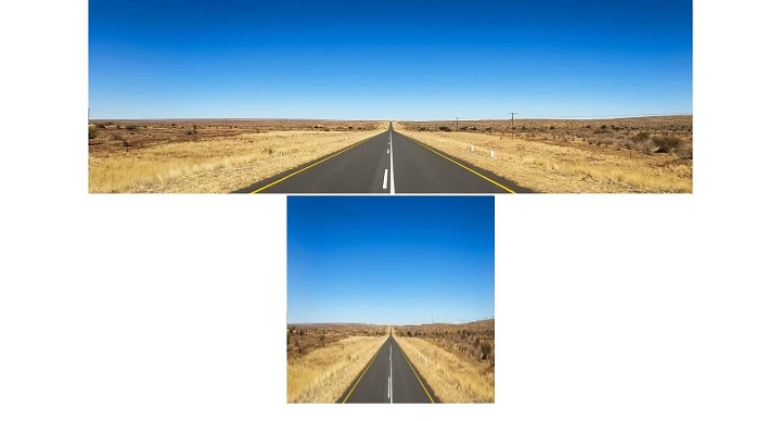
Contain (entire image)
Cover (fills container)
Fill (stretch fills container)
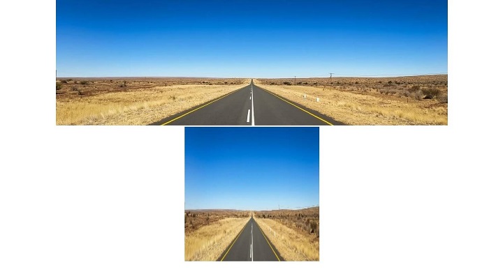
None (original size)
Scale-down (contain < none)
Full-width Images
Another good use case would be if we wanted our image to fill the full width of the screen, without changing aspect ratio. We can also center the image at the bottom to show more of the road with object-position. In this case we could use these styles
.image-to-fit {
  width: 100%;
  height: 400px;
  object-fit: cover;
  object-position: 50% 100%;
}
Conclusion
Object fit is a useful tool for quickly cropping images and videos without using the background property or a custom solution. Since there is practically never a good case for stretching images, this property is often helpful for maintaining aspect ratios.