CSS Flexbox Basics
March 22, 2020
What is Flexbox
Flexbox is a CSS layout module for creating containers that effectively align their content. It is a commonplace and useful syntax for setting up page layouts.
Items and Containers
Flexbox properties can be used on either item (child) or container (parent) elements. Properties for the container determine the overall direction, vertical, and horizontal alignment of each item it contains. Item properties allow for alignment changes to individual elements in the container.
Here are the properties for both Items and Containers
| Container Properties | Item Properties |
|---|---|
| display: flex | |
| flex-direction | order |
| flex-wrap | flex-grow |
| justify-content | flex-shrink |
| align-items | flex-basis |
| align-content | align-self |
Note: For some of these properties there are numerous other possible values. For the sake of brevity, I will only be mentioning the most common ones.
Container Properties
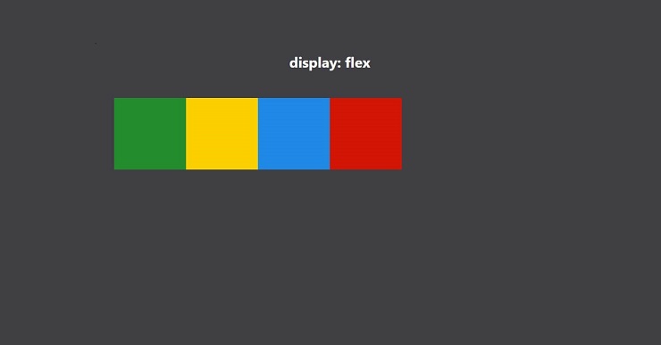
In order to create a flexbox, apply display: flex to the desired parent container. This will line each child item up in a row.
Flex-direction
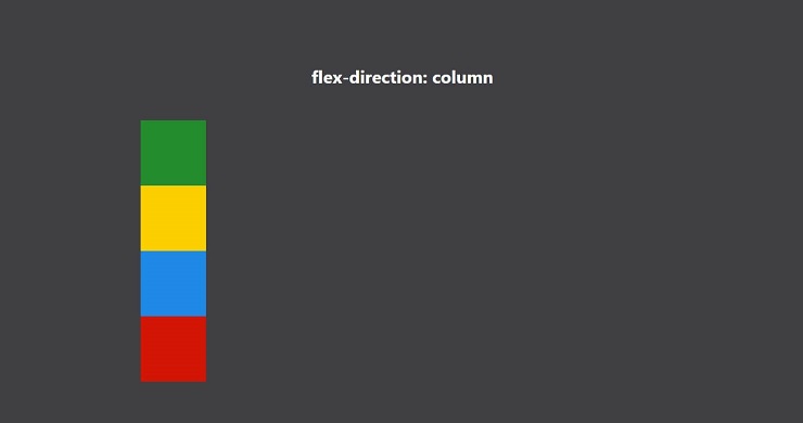
row | row-reverse | column | column-reverse
By default, this property is set to row, meaning your items will be aligned horizontally and in order. Changing this property to column will adjust the direction of your items to be aligned vertically instead. It is helpful to think of a flexbox like an axis, row being along an x-axis, and column along a y-axis.
If you wish to reverse the order of the items in your flexbox, this can be achieved with row-reverse or column-reverse. This can be useful for adjusting the order of navigation links on certain screen sizes.
Flex-wrap
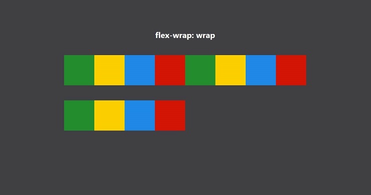
no-wrap | wrap | wrap-reverse
The default value here is no-wrap, meaning that the items in a flexbox will overflow out of the container instead of wrapping on to the next line. The value wrap will move items onto a new line instead. If you wish to reverse your items, wrap-reverse does the same thing as wrap, reversing the item order.
Justify-content
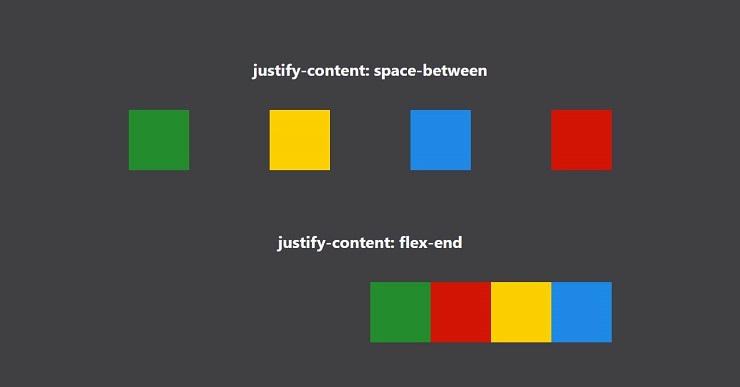
flex-start | flex-end | center | space-between | space-around | space-evenly
This property is the strawberry jam of flexbox. Oftentimes there will be extra space left over in your container. This is the property you set to distribute that space.
The values flex-start and flex-end will place your flexed items at the beginning or end of your container accordingly. If you want to center your content, center is the clear choice here. Using the values space-between, space-around, and space-evenly will distribute that extra space in often useful ways. space-between will place the first item at the start and the last item at the end, with equal space in between items. space-around will distribute the extra space equally to the left and right sides of each item (appearing as twice the space on inner elements). Finally, space-evenly will divide the remaining space “evenly” applied to every gap between and around items.
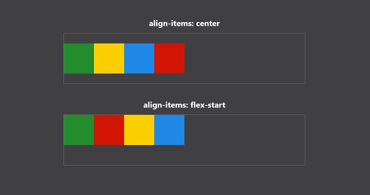
Align-items
flex-start | flex-end | center | stretch | baseline
This property is the toast to justify-content’s jam. Though named differently, these two properties go hand-in-hand. While justify-content aligns your items along the axis of a flexbox, align-items works across that axis.
In a row flexbox, this property will align your items vertically in a container. In a column flexbox, it will align them horizontally.
The first three values flex-start, flex-end, and center behave the same as for justify-content, except across the flexbox axis rather than along.
The value stretch, will set the height of every item in a row flexbox to be 100% of the container’s height. In a column flexbox, it will instead adjust the widths of these items.
Finally, the value baseline will behave similarly to center, except when flexed items contain text. In this case, it will use the bottom of the text rather than the centerline of the item. This is useful when you have text elements with varying heights/sizes.
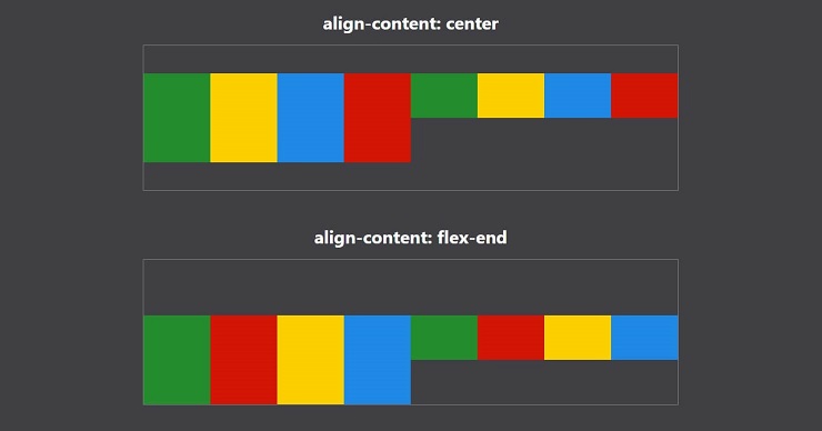
Align-content
flex-start | flex-end | center | space-between | space-around | space-evenly
This property behaves similar to justify-content except along the cross axis. align-content is only useful if flex-wrap: wrap is on and there are multiple lines to distribute space among.
Item Properties
A lot can be done in flexbox using container properties alone, especially if each item is styled the same. Item properties are useful for sizing and positioning individual items within a flexbox.
Order
number
This property is similar to z-index for html elements on a page. By default, flexed items will be displayed in standard order. Each element in a flexbox has a default of order: 0. Items will be placed in the flexbox from least to greatest order. Negative order items will be moved towards the beginning and positive towards the end.
This property is useful if you wish to adjust the order of your elements on specific screen sizes. In the following example, we can apply a different order value for each color class.
.green { order: 1; }
.red { order: 2; }
.blue { order: 3; }
.yellow { order: 4; }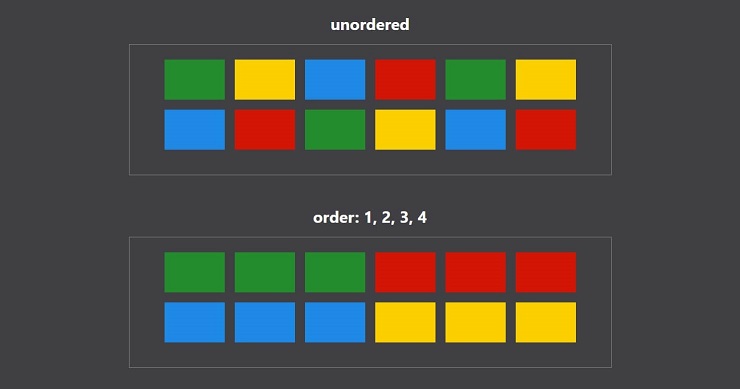
Flex-grow
number
This property determines how additional space will be distributed to items when the window gets larger. By default each item has flex-grow: 1 assigned. If a flexbox assigns additional size to items in its container, it will be according to each of the flex-grow proportions.
In the following example, I added flex-grow properties to the green and yellow color classes.
.green { flex-grow: 1; }
.yellow { flex-grow: 2; }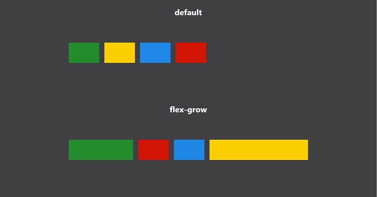
Flex-shrink
number
This property behaves similarly to flex-grow however it dictates how space will be removed from items when the window shrinks. Each element in a flexbox defaults to flex-shrink: 1
In the following example, I have bumped up the box width so that all boxes will be smaller than their assigned size in order to fit on the line. I also added flex-shrink to each element.
.green { flex-shrink: 1; }
.yellow { flex-shrink: 2; }
.blue { flex-shrink: 3; }
.red { flex-shrink: 4; }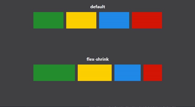
As you can see, the red element had the highest flex-shrink value, and it is the smallest element. This property will shrink each element according to how much additional space it would need for every item to be full-sized in the container.
Flex-basis
length
This property determines what size a flexed item should be before the remaining space is distributed. It takes in a length value such as pixels, %, rems, etc. By default flexed items have the value auto for this property. This means that each item’s basis will be that items default size. By increasing or decreasing this value, you can set the intended size of items in your flexbox.
In the following example, I have set each of the elements to have a different percentage values for flex-basis.
.green { flex-basis: 10%; }
.yellow { flex-basis: 20%; }
.blue { flex-basis: 30%; }
.red { flex-basis: 40%; }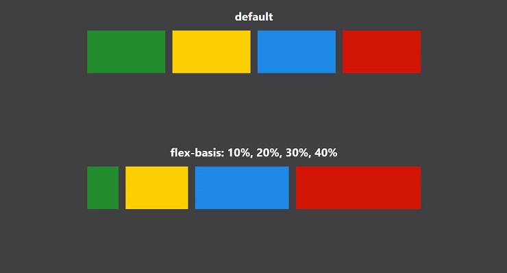
Align-self
auto | flex-start | flex-end | center | baseline | stretch;
Think of this property as the same align-items for indivdual items in a flexbox. This property defaults to auto, taking up whatever command is applied in align-items.
This property is useful if you wish to align certain items differently than the rest. Adding this property to a flexed item will override the value applied by align-items.
In the following example, I added align-self to the first 3 items.
.green { align-self: flex-start; }
.yellow { align-self: center; }
.blue { align-self: flex-end; }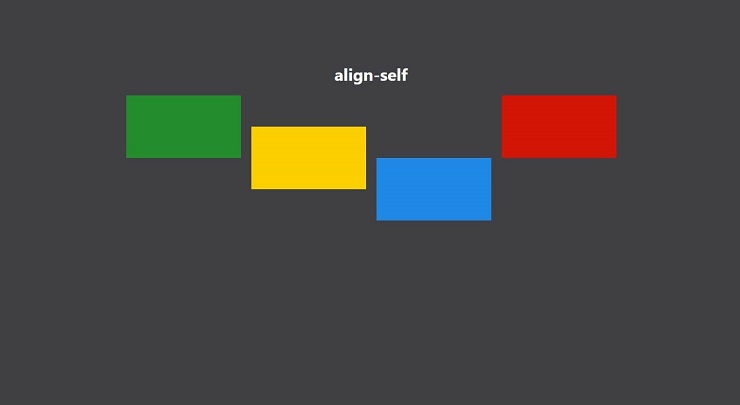
Overview
Flexbox is by far one of the most handy tools in the CSS arsenal. If you haven’t already been using flexbox in your projects, I highly recommend testing it out and practicing what you’ve learned. Having the ability to quickly align a large number of items exactly how you would like makes for extremely effecient layout implementation.
Bonus: Centering Items
With so many elements and nuances in web development, I often find myself searching stack overflow for how to center something. If you ever find yourself stuck trying to do the same, simply apply this set of properties to your parent item
.container {
  display: flex;
  justify-content: center;
  align-items: center;
}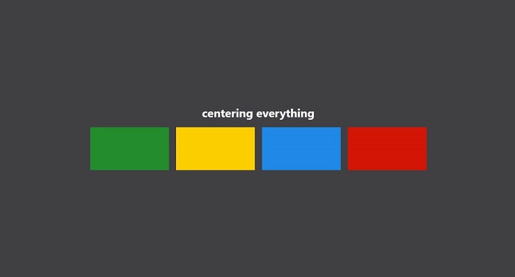
Even with 1 item (or only text) in your container, flexbox will position things exactly where you want them ;)